Animating the Accordion in React Native
Posted in react-native, react-native-reanimated, animations on May 21, 2024 by Hemanta Sapkota ‐ 5 min read

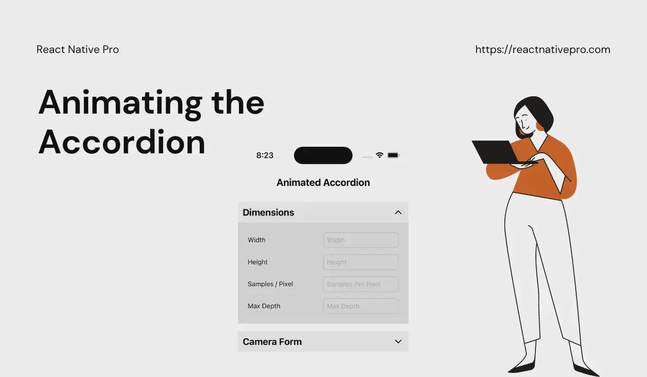
Creating smooth, interactive user interfaces is a key part of mobile app development. One common UI pattern is the accordion, which allows users to expand and collapse sections of content. In this post, we'll walk through how to animate an accordion in React Native, ensuring it provides a visually appealing experience. We'll use the code snippet provided to guide our explanation.
Animation Preview
Setting Up
First, let’s import the necessary modules and initialize our environment. We’ll need React, state and effect hooks, and several components from React Native. For animations, we’ll use the Animated API and LayoutAnimation.
import {LucideChevronDown, LucideChevronUp} from 'lucide-react-native';
import React, {useCallback, useImperativeHandle, useState, useRef, useEffect} from 'react';
import {
  StyleSheet,
  Text,
  View,
  Animated,
  LayoutAnimation,
  Platform,
  UIManager,
  TouchableWithoutFeedback,
} from 'react-native';
The conditional statement ensures that layout animations are enabled on Android devices.
if (Platform.OS === 'android' && UIManager.setLayoutAnimationEnabledExperimental) {
  UIManager.setLayoutAnimationEnabledExperimental(true);
}
Defining the Accordion Component
We define our Accordion component using React.forwardRef to allow parent components to control the accordion state if necessary.
type Props = {
  title: string;
  children: React.ReactNode;
};

export const Accordion = React.forwardRef((props: Props, ref) => {
  const {title, children} = props;
  const [isOpen, setIsOpen] = useState(false);
  const heightAnim = useRef(new Animated.Value(0)).current;

  const toggleOpen = useCallback(() => {
    LayoutAnimation.configureNext(LayoutAnimation.Presets.easeInEaseOut);
    setIsOpen(!isOpen);
  }, [isOpen]);

  useImperativeHandle(
    ref,
    () => ({
      open: () => {
        if (isOpen) {
          return;
        }
        return toggleOpen();
      },
    }),
    [toggleOpen, isOpen],
  );
Here, we use useState to track whether the accordion is open, and useRef to hold an animated value for the height. The toggleOpen function toggles the isOpen state and configures a layout animation to smoothly animate the change.
We’ll discuss more about useImpreativeHandle in the coming section.
Rendering the Accordion
Next, we define the rendering logic, including the title, the toggle icon, and the content area.
  return (
    <View style={styles.accordionSection}>
      <TouchableWithoutFeedback onPress={toggleOpen} accessibilityRole="button" accessibilityLabel="Toggle Accordion">
        <View style={[styles.accordionTitle, {flexDirection: 'row', justifyContent: 'space-between'}]}>
          <Text style={styles.accordionHeader}>{title}</Text>
          {isOpen ? (
            <LucideChevronUp color="black" />
          ) : (
            <LucideChevronDown color="black" />
          )}
        </View>
      </TouchableWithoutFeedback>
      <Animated.View style={[styles.accordionContent]}>
        {isOpen && <View>{children}</View>}
      </Animated.View>
    </View>
  );
});
The TouchableWithoutFeedback component wraps the title and icon, allowing the user to toggle the accordion by tapping anywhere in this area. The Animated.View component wraps the children, ensuring any changes to its height are animated.
Styling the Accordion
Lastly, we define the styles for the accordion.
const styles = StyleSheet.create({
  accordionSection: {
    marginBottom: 16,
  },
  accordionTitle: {
    padding: 10,
    backgroundColor: '#f0f0f0',
  },
  accordionContent: {
    overflow: 'hidden',
    backgroundColor: '#E0E0E0',
  },
  accordionHeader: {
    fontSize: 20,
    fontWeight: 'bold',
  },
});
Why Use useImperativeHandle?
In the provided React Native accordion component, the useImperativeHandle hook is employed to expose imperative methods to parent components. This allows the parent components to control the internal state of the AccordionSection, such as opening or closing it programmatically.
Purpose of useImperativeHandle
- Controlled Component: It enables the creation of a controlled component by exposing methods that can alter its internal state from the outside.
- Encapsulation: It provides a clean and encapsulated way to interact with the component, ensuring that the internal implementation details are hidden while exposing specific functionalities.
- Enhanced Interactivity: Allows for more complex interactions and behaviors by letting parent components directly influence the child component’s state.
How useImperativeHandle Works
useImperativeHandle accepts two arguments:
- ref: The ref that is passed from the parent component.
- createHandle: A function that returns an object with the methods to be exposed.
In our Accordion component:
useImperativeHandle(
  ref,
  () => ({
    open: () => {
      if (isOpen) {
        return;
      }
      return toggleOpen();
    },
  }),
  [toggleOpen, isOpen],
);
- Ref Argument:
refis forwarded from the parent component, allowing it to attach to the accordion component. - Create Handle Function: The function returns an object containing the
openmethod. This method toggles the accordion open state.
Example Scenario
Imagine a scenario where you have multiple accordions and a “Expand All” button in the parent component. Using useImperativeHandle, you can programmatically open all accordions from the parent:
const ParentComponent = () => {
  const accordionRef = useRef(null);

  const handleExpandAll = () => {
    accordionRef.current.open();
  };

  return (
    <View>
      <Button title="Expand All" onPress={handleExpandAll} />
      <AccordionSection ref={accordionRef} title="Accordion 1">
        <Text>Content 1</Text>
      </AccordionSection>
      {/* Additional AccordionSections */}
    </View>
  );
};
In this setup, useImperativeHandle empowers the parent component with the ability to control the accordion’s state, enhancing flexibility and interactivity.
Full source code
import {LucideChevronDown, LucideChevronUp} from 'lucide-react-native';
import React, {useCallback, useImperativeHandle, useState } from 'react';
import {
  StyleSheet,
  Text,
  View,
  Animated,
  LayoutAnimation,
  Platform,
  UIManager,
  TouchableWithoutFeedback,
} from 'react-native';

if (
  Platform.OS === 'android' &&
  UIManager.setLayoutAnimationEnabledExperimental
) {
  UIManager.setLayoutAnimationEnabledExperimental(true);
}

type Props = {
  title: string;
  children: React.ReactNode;
};

export const Accordion = React.forwardRef((props: Props, ref) => {
  const {title, children} = props;
  const [isOpen, setIsOpen] = useState(false);

  const toggleOpen = useCallback(() => {
    LayoutAnimation.configureNext(LayoutAnimation.Presets.easeInEaseOut);
    setIsOpen(!isOpen);
  }, [isOpen]);

  useImperativeHandle(
    ref,
    () => ({
      open: () => {
        if (isOpen) {
          return;
        }
        return toggleOpen();
      },
    }),
    [toggleOpen, isOpen],
  );

  return (
    <View style={styles.accordionSection}>
      <TouchableWithoutFeedback
        onPress={toggleOpen}
        accessibilityRole="button"
        accessibilityLabel="Toggle Accordion">
        <View
          style={[
            styles.accordionTitle,
            {flexDirection: 'row', justifyContent: 'space-between'},
          ]}>
          <Text style={styles.accordionHeader}>{title}</Text>
          {isOpen ? (
            <LucideChevronUp color="black" />
          ) : (
            <LucideChevronDown color="black" />
          )}
        </View>
      </TouchableWithoutFeedback>
      <Animated.View style={[styles.accordionContent]}>
        {isOpen && <View>{children}</View>}
      </Animated.View>
    </View>
  );
});

const styles = StyleSheet.create({
  accordionSection: {
    marginBottom: 16,
  },
  accordionTitle: {
    padding: 10,
    backgroundColor: '#f0f0f0',
  },
  accordionContent: {
    overflow: 'hidden',
    backgroundColor: '#E0E0E0',
  },
  accordionHeader: {
    fontSize: 20,
    fontWeight: 'bold',
  },
});
Conclusion
The accordion component is particularly important in React Native for displaying a large amount of information in a compact form. It allows developers to present extensive content in a well-organized manner, reducing clutter and improving readability. By expanding and collapsing sections, users can quickly access the information they need without being overwhelmed. This approach not only enhances the user experience but also helps in maintaining a clean and efficient design, crucial for mobile applications where screen space is limited.
Stay tuned for more React Native tips and tutorials!
comments powered by Disqus